Masthead trials
- Deea Irimiciuc
- Apr 22, 2019
- 1 min read

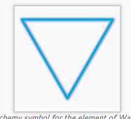
In the beginning I wanted the Masthead to have a 'subliminal' meaning, or at least to have some kind of deeper meaning than just a normal title. I searched for the four elements' symbols and they all had a triangle incorporated into it. It happens that the water element had a reversed triangle as a symbol. I tried to integrate all the variations in the title but I ended up only helping a small triangle in M. You can see that I tried making the triangle really prominent and the 'star' of the masthead, but then got the idea with the triangle being 'hidden' in M. Plus, it was too 'pretty' and 'delicate' for my magazine. I wanted something more rigid. I started by focussing the attention on M and kind of making two triangles, but I felt that it was anesthetic and the top line was completely weird, so i took it out. A college told me to draw a line that would unite everything, which gave me me the idea to put it exactly in the middle, where the smaller line from M an the middle line from the E's interact.


Comments